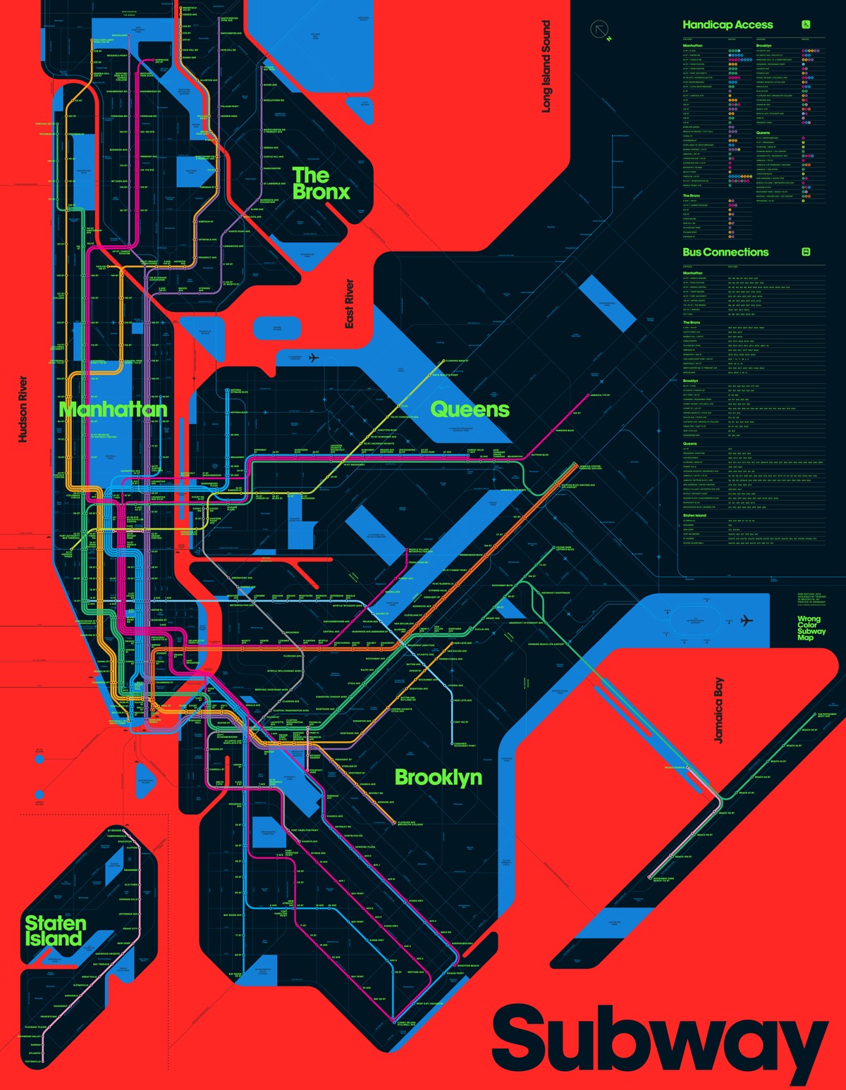
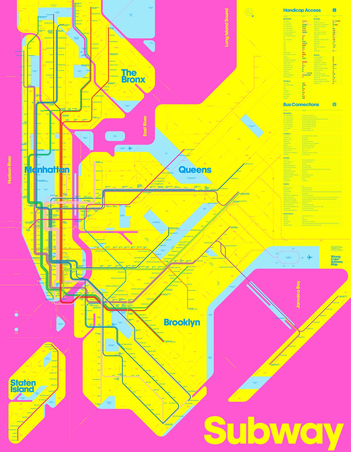
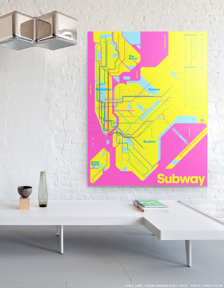
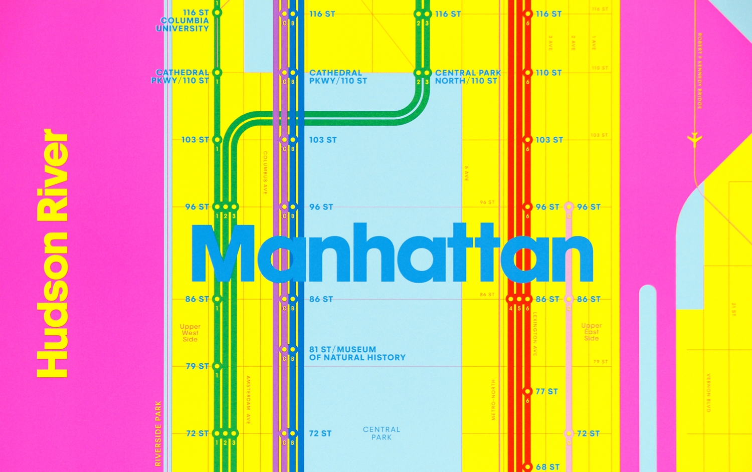
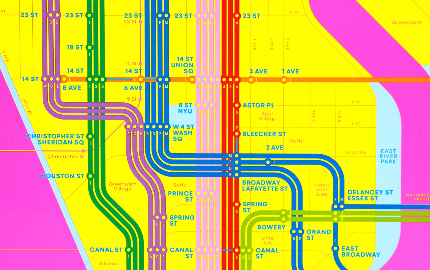
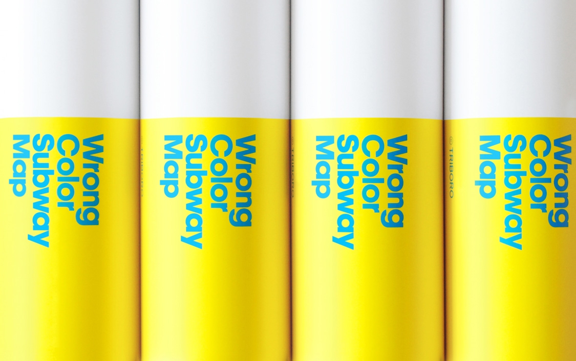
the New York Subway,
using only the most
inappropriate colors.
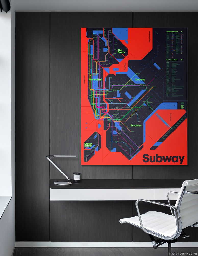
An eye-popping,
large-format poster
perfect for your
home or the office.
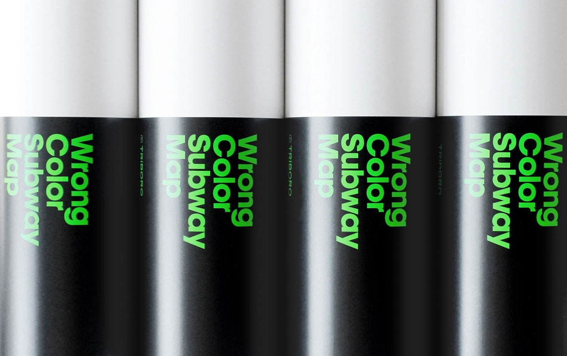
using the finest
paper and advanced
Heidelberg presses.
Available in two
editions inspired by
the RGB and the
CMYK color models.
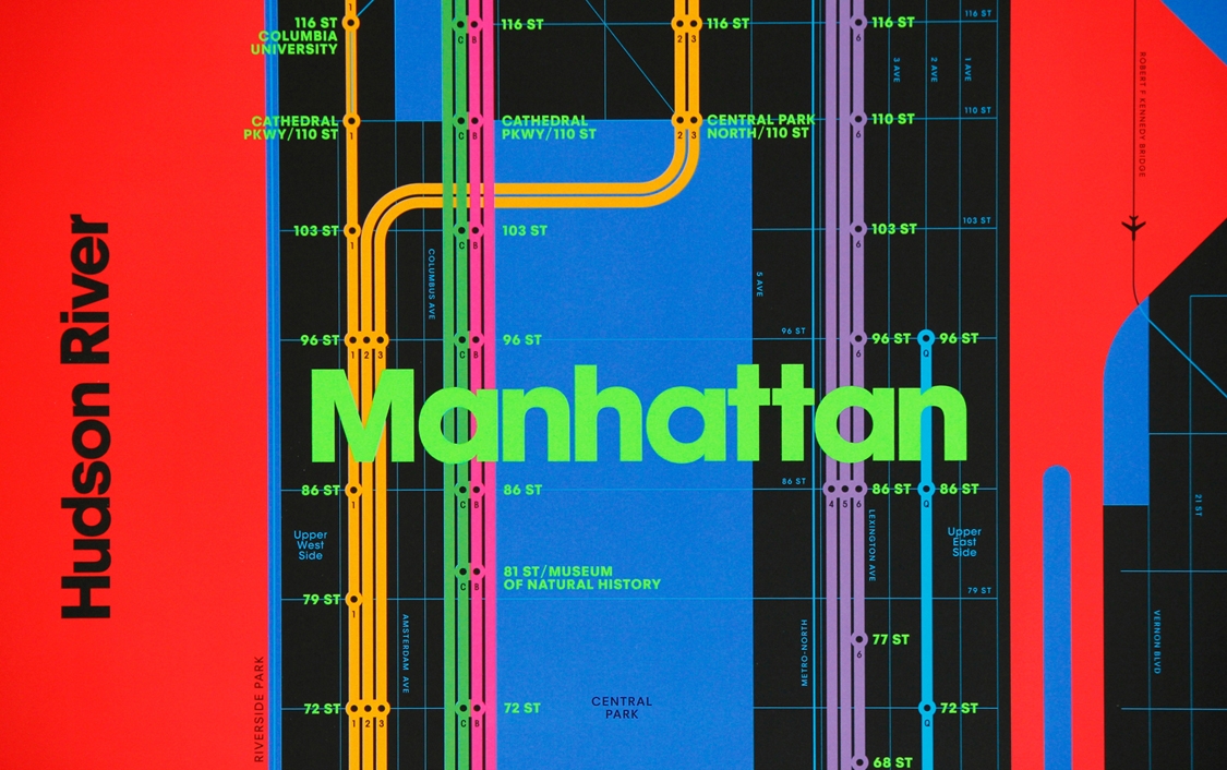
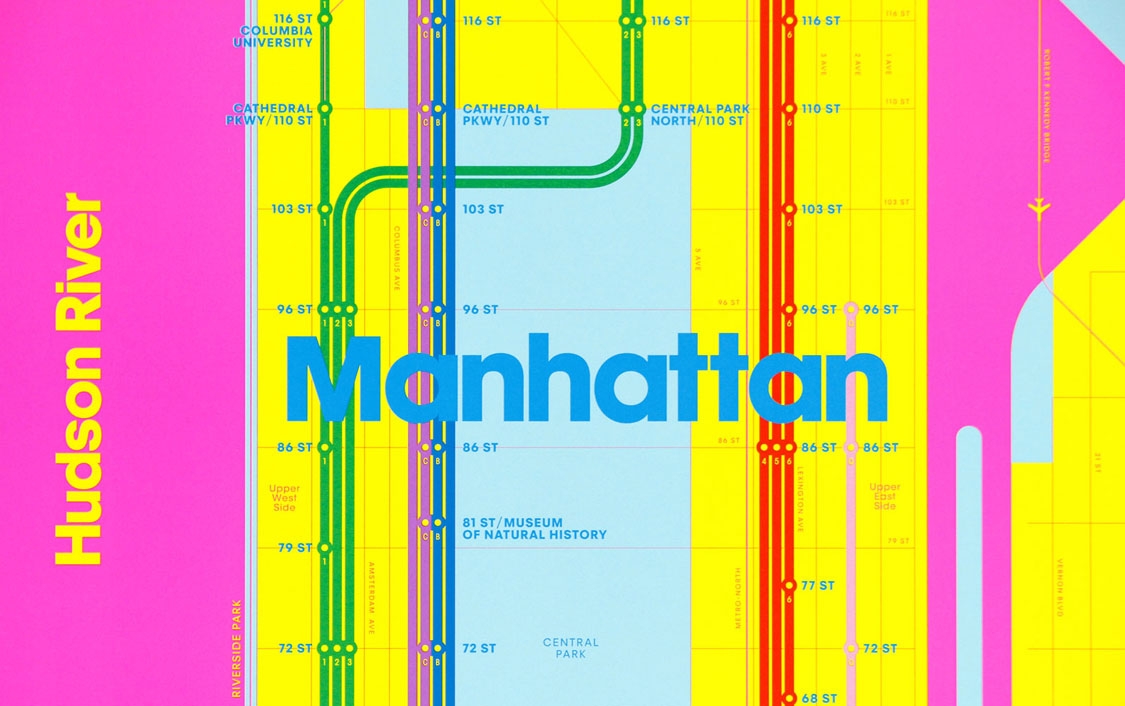
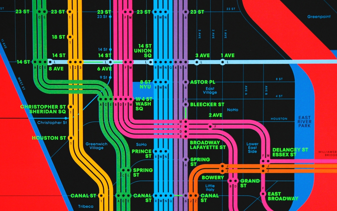

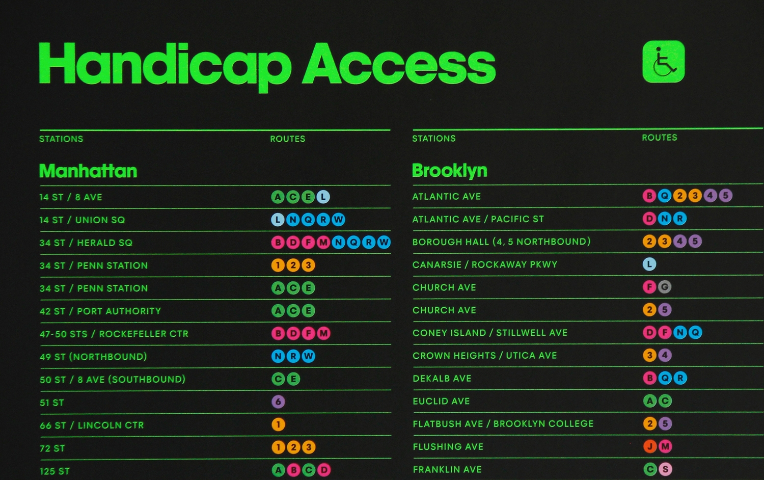
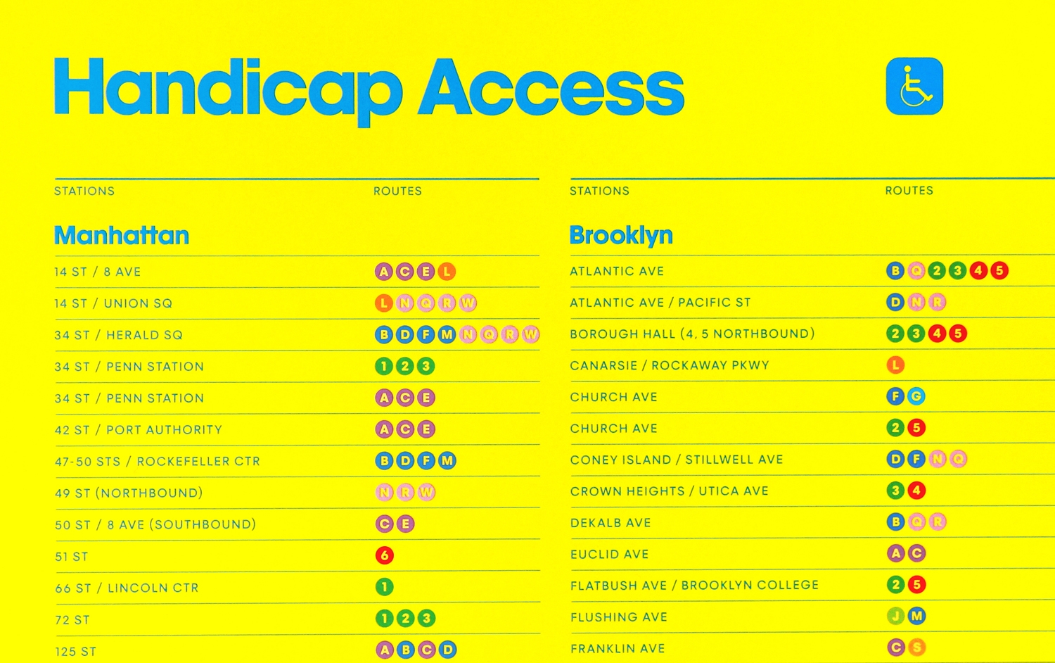
Our fascination with the New York Subway began when we moved to Brooklyn sixteen years ago. Our first attempt to design a map for the system, the One-Color Subway Map, earned many fans and quickly sold out. Since then we have been tinkering with the design. The Wrong Color Subway Map is the next evolutionary leap. One color has expanded into multitudes—and they are all totally wrong. Subway lines have traded their familiar shades for vibrant alternatives. For all the rivers, parks and landmasses, we chose the most inappropriate colors we could think of. Meanwhile every inch of the poster has been redesigned to make it even more refined, precise and (to our eyes) beautiful. We even future-proofed the map by including the soon-to-open 2nd Avenue Subway line. Did we forget to mention the poster is massive, measuring 45 x 58 inches (1143 x 1473 mm). Printed in Germany on the most advanced Heidelberg presses, we have selected a high quality heavyweight matte paper (90 lb cover / 250 gsm). We had trouble choosing a single palette, so we decided to launch this project with two different editions, inspired by the RGB and CMYK color models. Each edition has its own personality, RGB is sleek and bold, CMY is friendly and glowing. We know you will enjoy our Wrong Color Subway Map as much as we enjoyed designing it. — TRIBORO